Design Progression:
Low-fidelity Wireframe
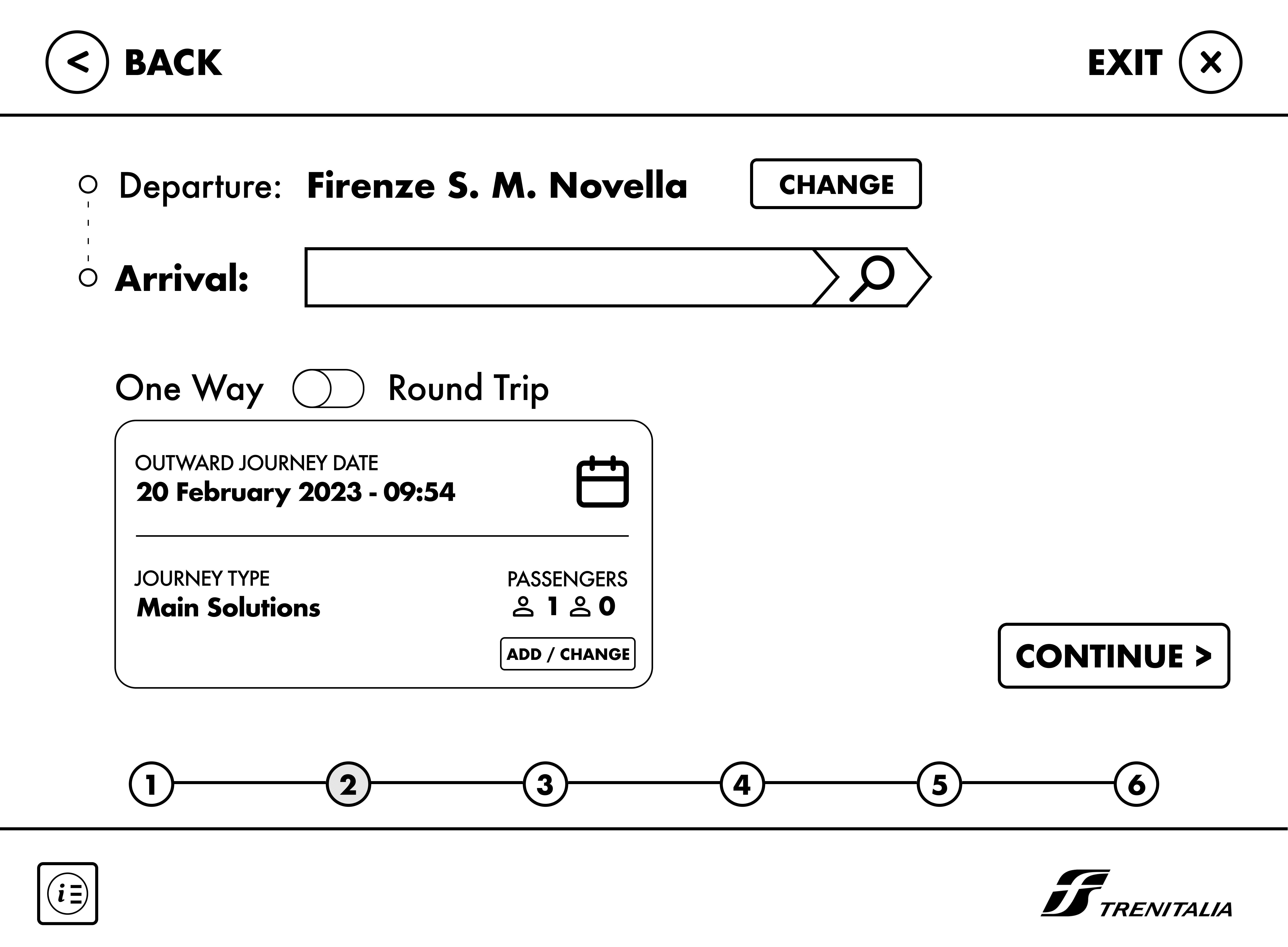
My design journey started with a basic prototype where I created the page's layout and content. This was a crucial initial step because it helped me express my ideas in response to issues I identified in the current design and user interface. By using this approach, I could swiftly generate designs, gather feedback, and concentrate on key features.
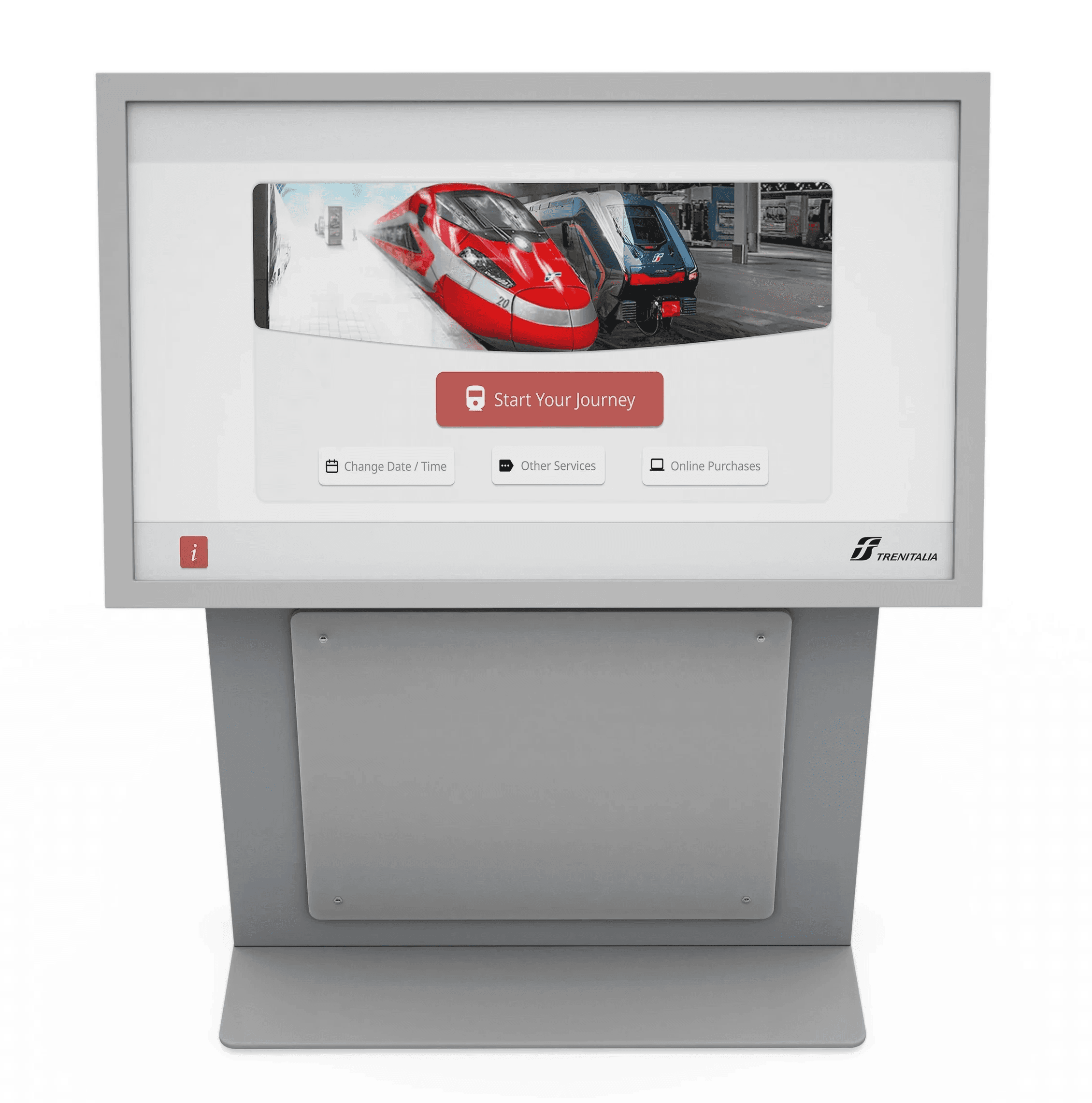
High-Fidelity Prototype
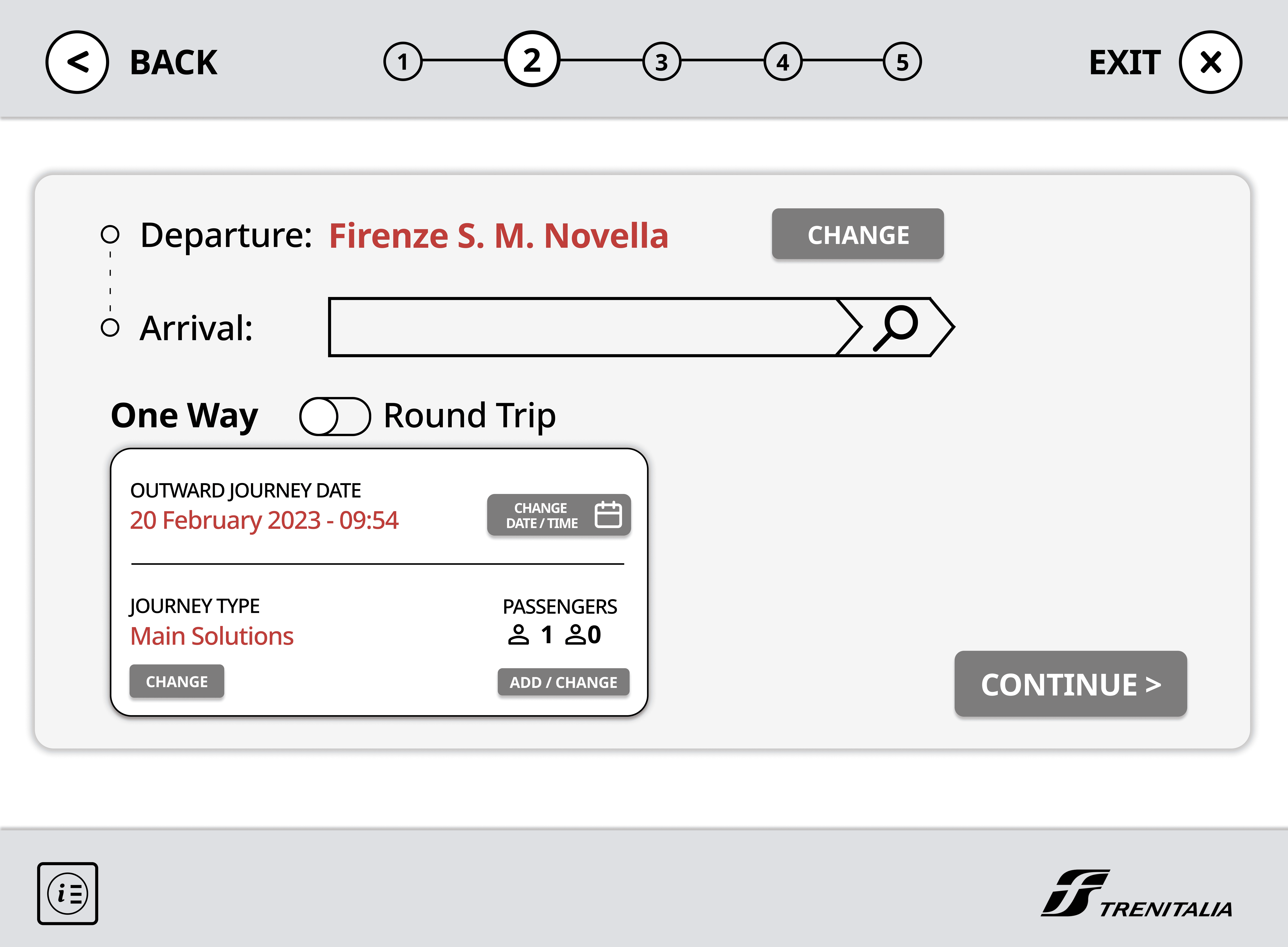
In my design journey, I upgraded my basic wireframe to a more refined high-fidelity version.
For the color scheme, I drew inspiration from Trenitalia's logo, with a vibrant red as the main accent. I balanced this bold red with a range of gray shades to fill in buttons and icons. To maintain a clean and consistent look, I ensured that all buttons were a sleek dark gray, adding subtle white highlights for cohesion.
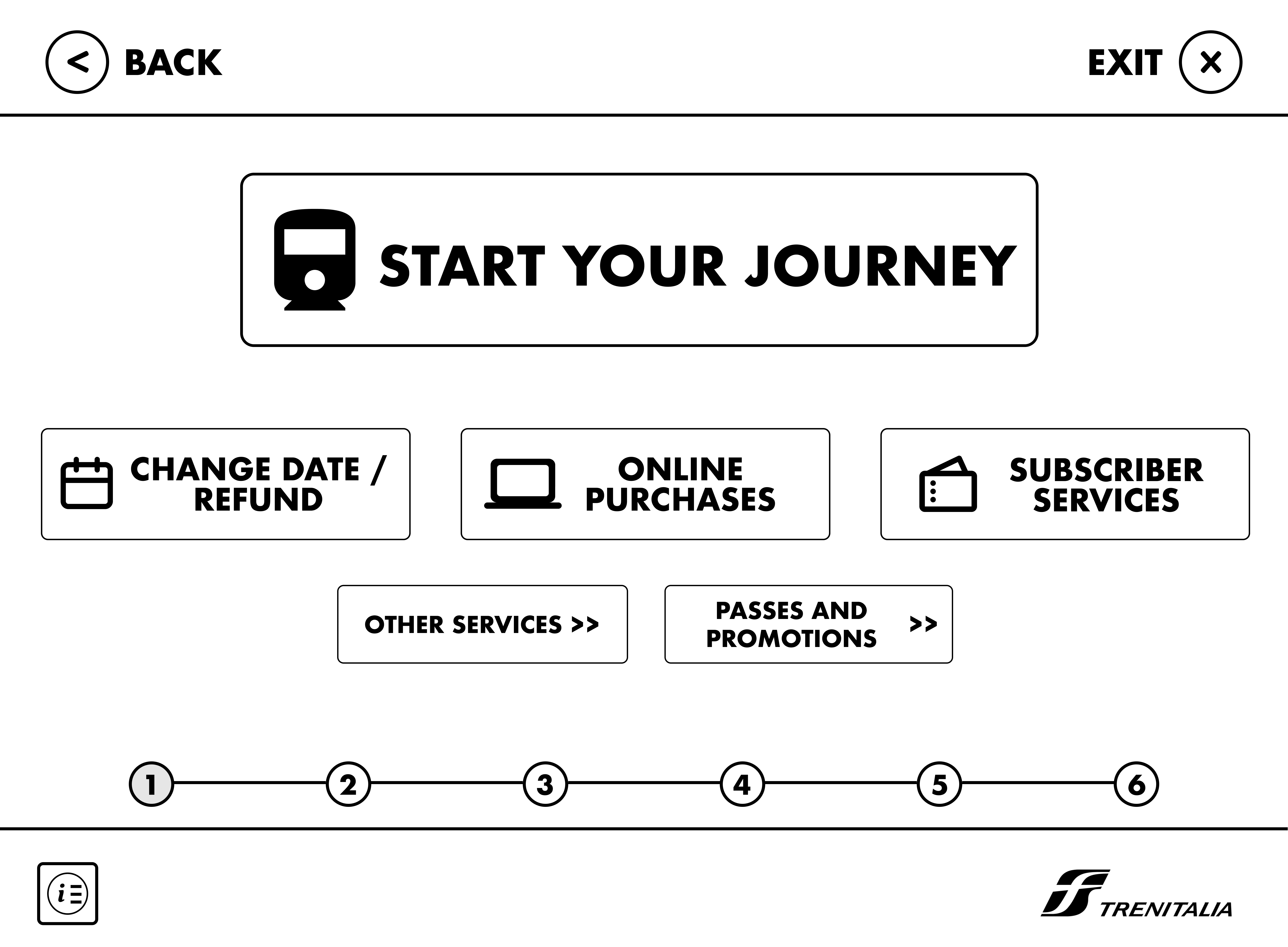
Based on this design, I received valuable feedback from my professor, which greatly influenced my final design. One key observation was that the use of a dark black outline in both the journey page and the progress bar didn't align with the modern aesthetic I was aiming for.
Furthermore, I was struggling with making my designs feel realistic, especially in the context of a train station. It was at this point that my professor encouraged me to explore design systems, a concept I delved into and then incorporated into my work to ensure consistency across buttons and design elements.
To achieve the sleek and modern UI design I desired, I also sought inspiration from other websites and apps with clean and simple designs. These insights proved instrumental in shaping my creative process.
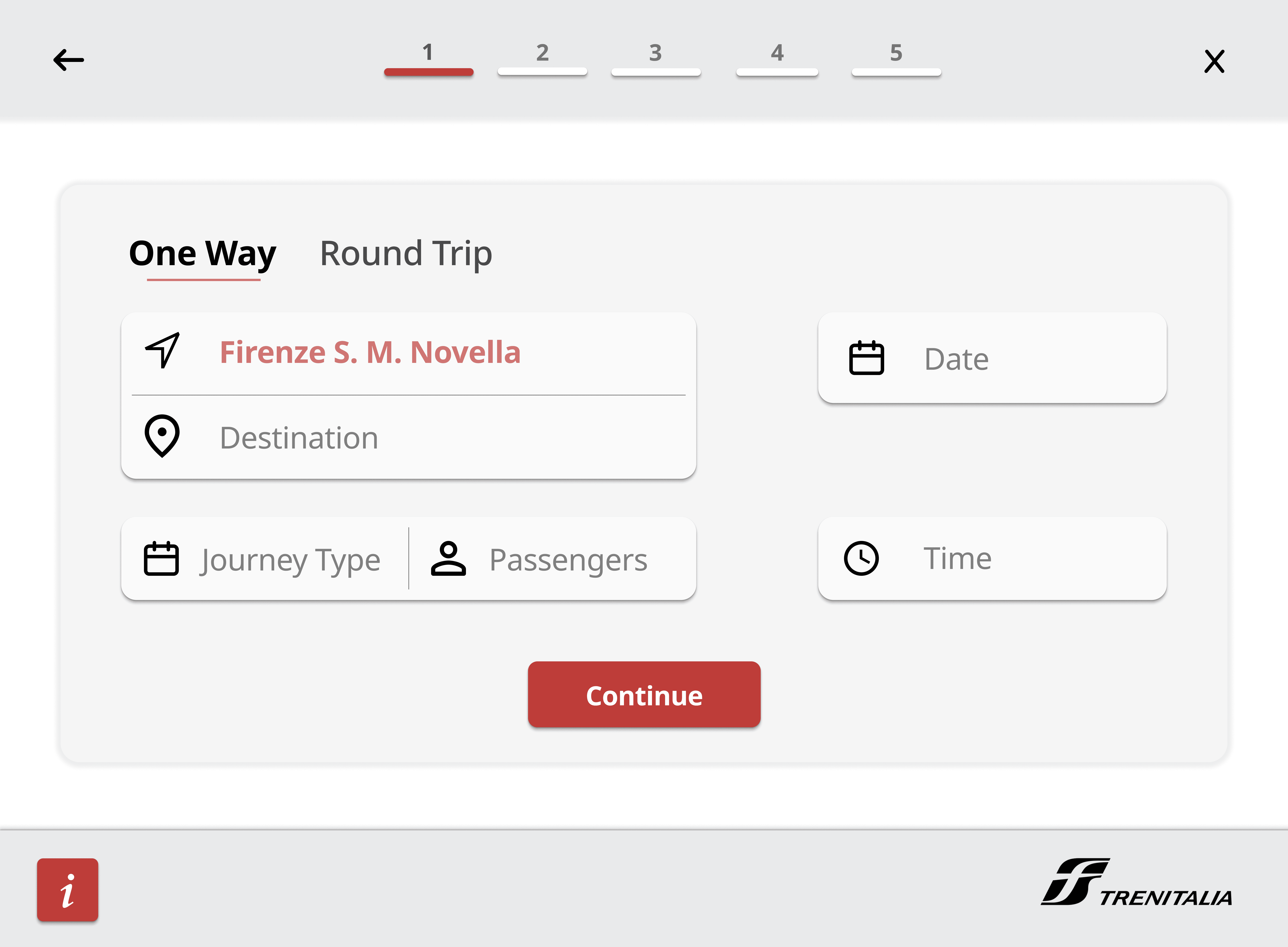
Final Design
The feedback and input I received heavily shaped my final design. I made sure to tackle the problems I spotted in the original design, like the outdated interface, lack of intuitiveness, and distracting colors. I'm pleased to say that I successfully addressed these concerns with my clean and modern UI. It's important to me that my design feels realistic and suitable for implementation at train stations, and I'm confident that I achieved that.